
Where to Draw the Line: How Earth Observation Data Can Help Design High-Performing Agricultural Insurance
Delayed rains and lingering heat cause a Kenyan farmer’s crops to fail. He expects his insurance to provide some relief, but it never arrives.
Even though it’s unfortunate, it isn’t always a mistake. Verifying loss claims on every farm is often slow and expensive, so many programs use area-level indicators (often averages) instead to trigger payouts. That area-level approach used by index insurance programs lowers administrative costs and can increase speed -- expanding access to insurance in places it might not otherwise be available -- but it comes with the tradeoff of possibly missing localized damages within that area. Especially when experiences vary widely within an area, payouts based on an area average may not trigger even when some farmers inside it are struggling.
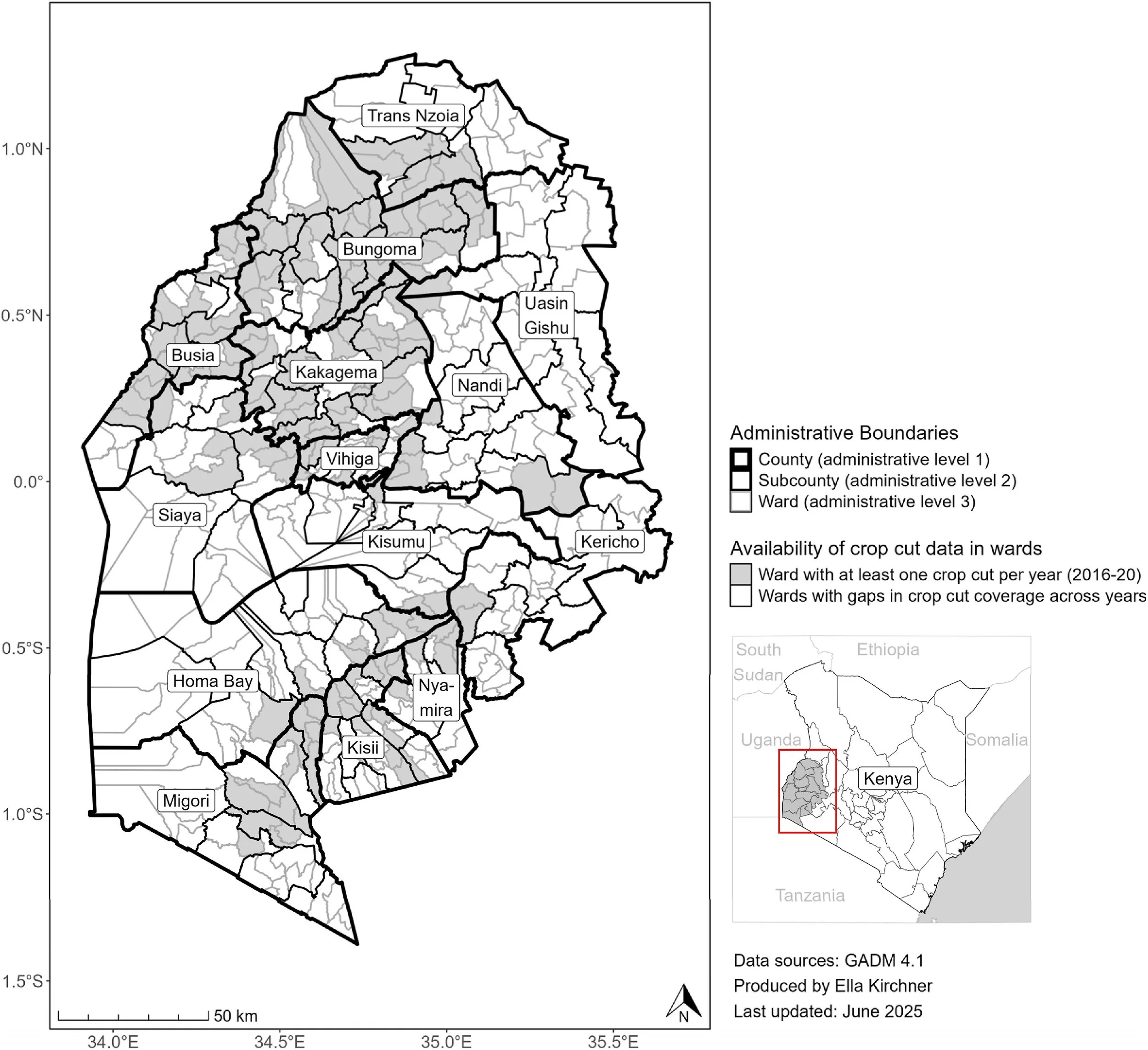
Study region in Western Kenya. The map shows administrative boundaries at county, sub-county, and ward levels, as well as which wards had crop cut data available for analysis.
These areas go by different names (often “unit areas of insurance”, or “insurance zones”), but the idea is the same: their boundaries define the footprint over which conditions are monitored and payouts activated. A new paper in the Journal of Development Economics led by NASA Harvest researchers explores how the construction of these zones influences index insurance performance.
In practice, insurance zones often follow administrative borders: counties, districts, and subcounties. Crops, however, do not necessarily care about political lines. Rainfall, temperature, soil quality, and other growing conditions can both cross these boundaries and vary within them
“Administrative boundaries are often straightforward, but they’re not necessarily the best way to capture how similar crop growth patterns are within that area,” says Elinor Benami, an assistant professor at Virginia Tech, NASA Harvest affiliate, and co-author of the study. “That mismatch can result in some producers getting burned or even being worse off than without insurance, even when the index is reflecting the area’s average as originally designed.”
The paper looked at how changing these boundaries influences the value of insurance to producers. The researchers used earth observation-derived data on rainfall, temperature, vegetation, and soils in a major maize-growing region of Kenya that corresponded to the sites of over 13,000 field-level yield measurements collected over 5 years.
In particular, they leveraged the satellite-based environmental data to group nearby areas that tend to exhibit similar growing conditions. This doesn’t predict yields directly but instead generates zones that, in principle, should make the resulting field-based yield averages more meaningful. The researchers then evaluated how these data-driven zone maps compare to existing county and subcounty scale boundaries as well as simulated multiple area-yield insurance programs using differing numbers of zones, the crop cuts costs, and intensities of field sampling. Comparing all of these simulations allowed them to evaluate what types of designs capture more of the observed variation in yield risk within a given area while also accounting for costs of generating the average estimate in the zone.
They found that data-driven zones can outperform existing boundaries, but to varying degrees.
One of the most important factors driving performance comes down to measurement within the zones. Estimating average yields requires crop cuts and crop cuts cost money. If too few are collected, the averages are noisy and payouts become unreliable. If many are collected, premiums rise due to the rising cost of collection. Those costs are not hypothetical: they are paid by farmers, insurers, or governments, and they determine to what degree the insurance program can make someone better off.
While many might intuitively think that smaller zones are automatically better, this study illustrates where that thinking can go awry. In western Kenya, yields can be highly variable even over short distances. Splitting regions into multiple small zones reduces some mismatch, but it also multiplies data requirements and collection costs. These increased costs make it harder to get enough data to get a reliable estimate for each zone while increasing premiums for the insured.
“Better data can help, but it doesn’t automatically fix the problem,” says Ella Kirchner, a postdoctoral fellow and NASA Harvest affiliate also at Virginia Tech. “If insurance is expensive or based on too little information, farmers can end up worse off than if the insurance never existed at all.” This research matters, as it illustrates how even seemingly small design choices can determine whether an insurance program is capable of fulfilling its promise of effective risk management for farmers.
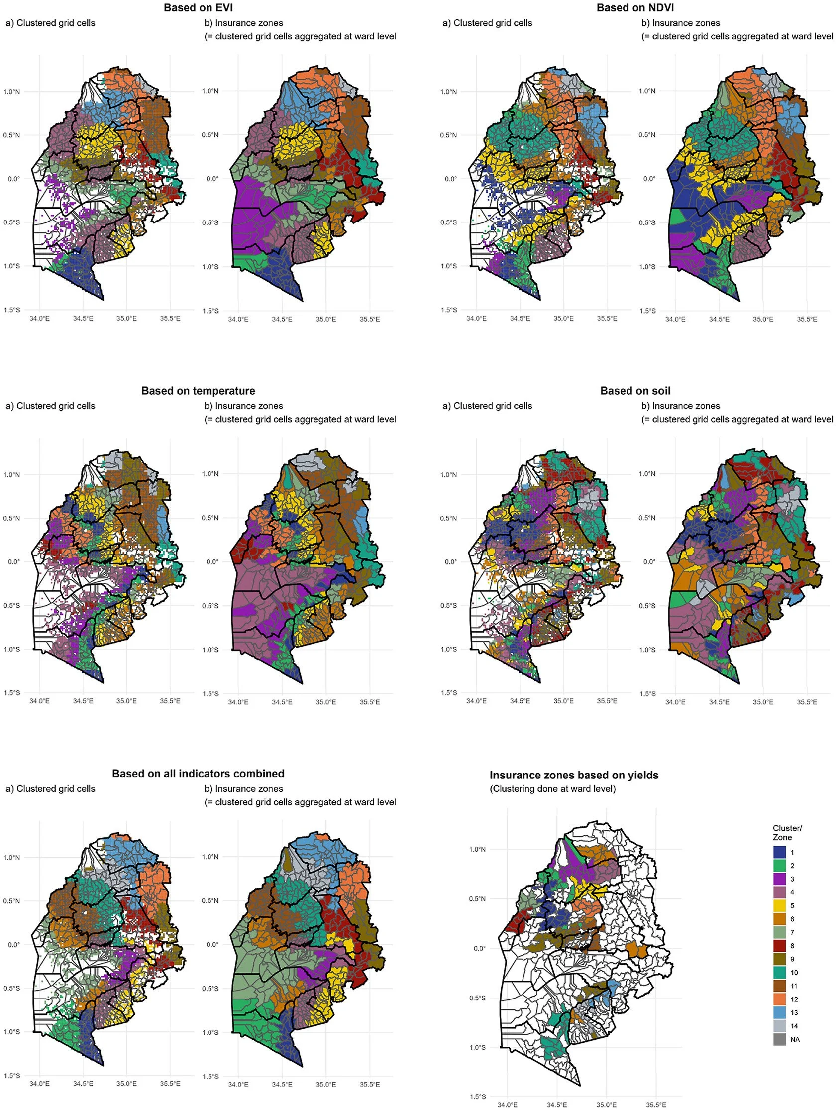
These maps provide example data-driven insurance zones based on different environmental factors. For each factor, the left map shows clusters created at the grid cell level, and the right map shows the resulting insurance zones after those clusters are assigned to wards based on the most common cluster within each ward. All maps display 14 zones, matching the number of counties in the study area.
Overall, this study emphasizes that the role of earth observation in improving insurance does not have to just revolve around picking the index: when used in the service of improving human-centered outcomes, it can also be used to help define areas that behave more similarly and evaluating the tradeoffs of how intensely to monitor those areas.
NASA Harvest’s broader work aims to make this kind of earth observation-based evidence easier to use in practice by working with partners across a range of applications, from helping target and prioritize on-the-ground sampling and reporting and conducting broad scale agricultural monitoring to supporting early warning and disaster response.
Learn more about the researchers’ findings and implications for agricultural insurance here.
The full citation: Kirchner, E., Benami, E., Hobbs, A., Carter, M.R. and Jin, Z., 2025. Get in the Zone: The Risk-Adjusted Welfare Effects of Data-Driven vs. Administrative Borders for Index Insurance Zones. Journal of Development Economics, p.103658.
Co-authors on the paper include Andrew Hobbs, University of San Francisco; Michael R. Carter, University of California-Davis; and Zhenong Jin, The Institute of Ecology at Peking University (formerly University of Minnesota)